


What if you could measure happiness and sadness, the peaks and troughs, just by analyzing the sentiment of your Twitter timeline? And then take it one step further, change the background color, or even the facial expression of your avatar based on that sentiment. One of our developers here at Tinybird, @alrocar, decided to do just that.
Show your stripes
When I saw Ed Hawkins’s #ShowYourStripes for global warming, it struck a chord. In a single graphic, he showed how global average temperatures have changed over the past 170 years. I wanted to do something similar, but with the sentiment of my Twitter timeline.
Twitter doesn’t provide any type of analysis, just raw data. And it’s not easy to analyze the data in real time. First, I had to stream the tweets from my Twitter timeline using their API. Next, I parsed the text, before analyzing its polarity with TextBlob. The mood of my timeline is now reflected in the color stripe on my Twitter banner and the expression of my avatar. Colors and expressions change depending on the sentiment. Each of the 150 stripes in my banner represents the average sentiment of my timeline every hour for the last 150 hours, approximately the last week. In this thread, I’ve explained how I stacked the building blocks of the Twitter API, Tweepy, TextBlob, Pillow and Tinybird to create my avatar and banner.
Sidenote: I don’t follow a large number of accounts, so my timeline naturally has fewer tweets. With Tinybird, it doesn’t matter if it’s a few events per second or thousands - once you’ve built your pipeline, it scales instantly.
What do your timeline stripes reveal about you?
My timeline is a pretty accurate reflection of my own sentiment. At first, there were a lot of green stripes, an indication of positive sentiment. In recent weeks, the number of red stripes has skyrocketed, as the war in Ukraine has become a central focal point. One interesting observation was when I switched my timeline from a chronological timeline to a ‘Top Tweets’ timeline based on Twitter’s recommendations, the polarization skyrocketed. There were many more instances of red stripes, an indication of more diverse opinions, but also arguments.
For my next project, I also used Twitter data for even more visualizations. I’m now tracking which emojis are used the most in tweets at a rate of 100 tweets/second. You can check out my code in my GitHub repository.
Getting started with realtime Twitter data
We’ve put together a starter kit for you to build your own project using realtime Twitter data. Follow the instructions below to create a dashboard that displays the occurrence of a chosen word over a set period of time.
- Use this Jupyter Notebook to specify the words you’d like to use, select tweets from Twitter’s streaming API with Tweepy, and then stream the JSON objects to your Tinybird Data Source.
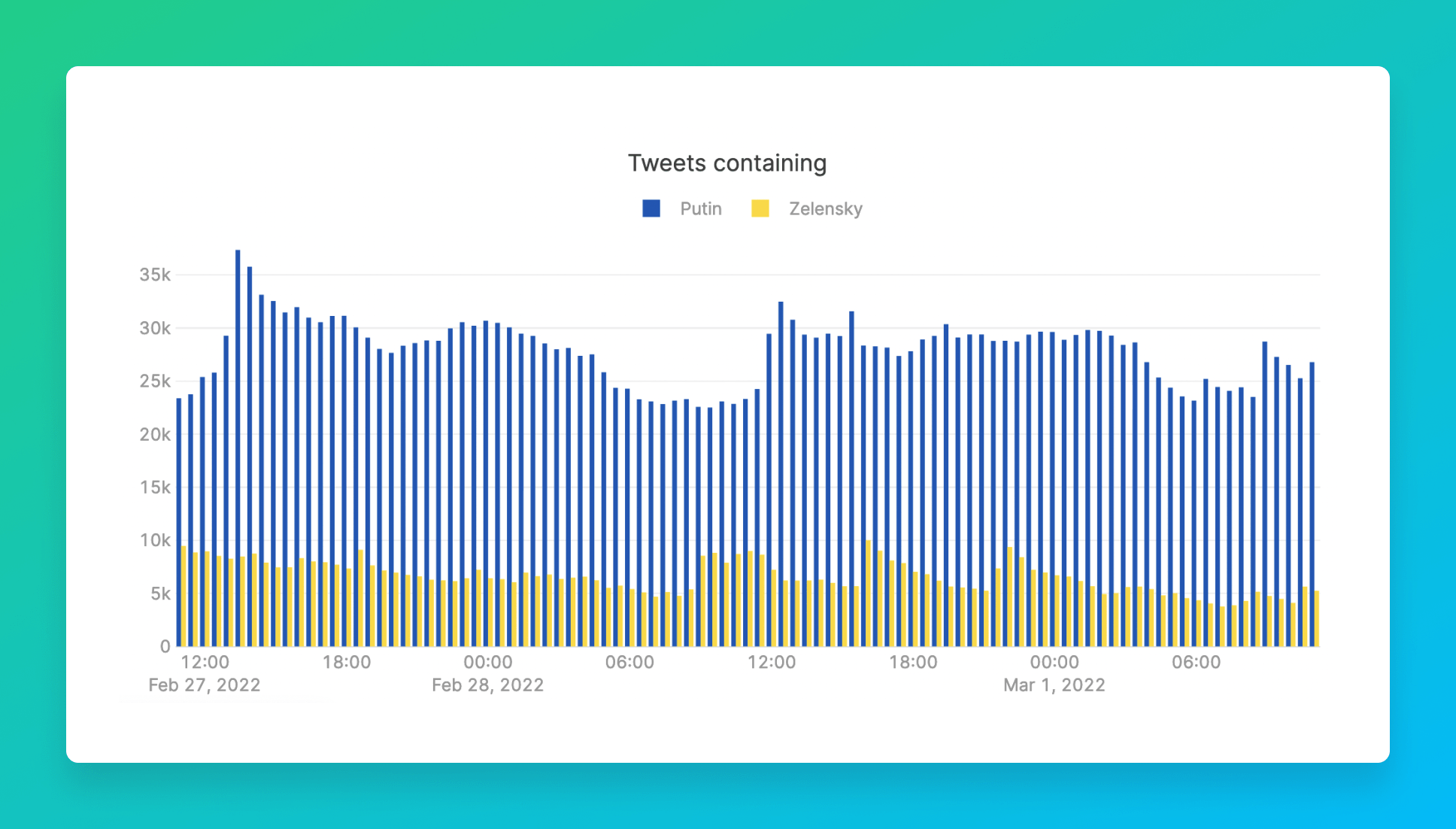
- This Retool dashboard is based on over 10 million tweets ingested over three days. The interactive charts display counts per minute, 10 minutes or 30 minutes depending on the selected range of dates and times (up to 2 hours, between 2 hours and 1 day, over 1 day). Here are the Tinybird Data Source schemas, Pipes and API endpoint to generate the data for the charts.
Join our community Slack channel and tell us what you’ve built with Tinybird and your tweets.