


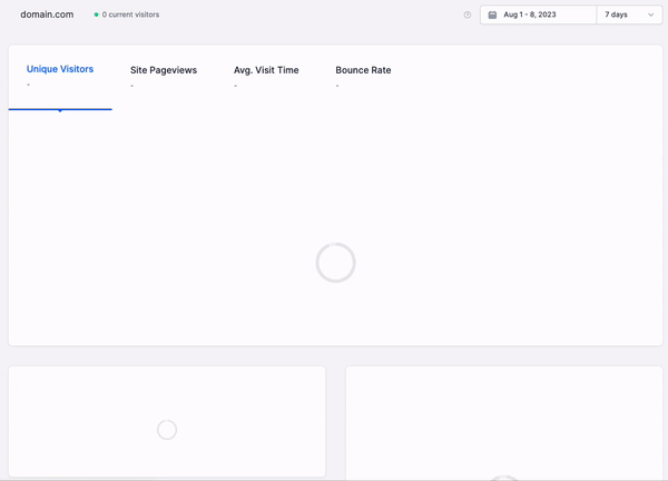
Everybody hates a slow dashboard. And while we’re all quick to blame Tableau, PowerBI, or Looker for the sluggishness, it’s often the underlying data architecture at fault.
When we go hunting for real-time data visualizations, we’re looking for dashboards that will refresh in a snap and display the very latest data, even when the underlying dataset constitutes “big data” that is in constant motion. It’s a real-time dashboard dream that everybody, from analyst to executive, wants to see become a reality. But bad data practices and flawed architectures jeopardize this utopian vision.
This post discusses real-time data visualization: What makes dashboards slow, how to fix it, and strategies for designing a faster data model.
In this post, I’ll explore the fundamentals of real-time data visualization: What makes dashboards slow, and how do you fix them? I’ll share some strategies for building faster analytics dashboards, starting with the underlying data architecture, so you can start gaining real-time insights from all those pies, bars, and lines.
What is Real-time Data Visualization?
There’s little to add to the name itself. Real-time data visualization is the process of presenting data visually in real time, allowing users to monitor and analyze data as it is being generated and processed.
Real-time data visualization is more than just data points and lines on a graph, though. It builds upon the promise of real-time analytics, in which the freshest data can be filtered, aggregated, and enriched in a matter of milliseconds and accessed with very minimal latency while serving a highly concurrent set of requests.
Both internal stakeholders and external customers want a dynamic and interactive way to explore data, and this is what real-time data visualization offers, enabling faster decision-making and problem-solving.
Why you should care about visualizing data in real time
Both internal stakeholders and external users expect to be able to interact with the data they need in a visual manner. Whether that’s through user-facing dashboards embedded in an application, or showing an interactive dashboard using PowerBI at a board meeting.
Real-time data visualization plays a vital role in helping businesses and their customers identify trends and respond quickly to changing circumstances, and its power has been proven across a broad swath of industries and use cases.
For instance, in the healthcare industry, real-time data visualizations monitor patient vital signs, track the availability of hospital beds, and analyze disease risk.
Real-time data visualization is also critical in the financial sector, where financial institutions use real-time charts, graphs, and dashboards to monitor stock prices, assess market trends, and determine when to make optimal trades.
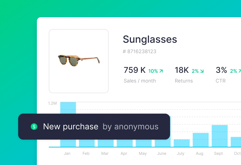
Real-time data visualization is useful for content creators on social media platforms who want to track performance trends for the content they create as soon as they click “publish”.
Real-time visualization is also immensely valuable in e-commerce, especially during massive, short-term sales like Black Friday. Large retailers need real-time insights into sale performance so they can adjust tactics, pricing, and offers immediately before the sales window closes. For this reason, many e-commerce companies move off of platforms like Google Analytics because they lack the necessary speed to keep up with the rapidly changing trends of buyers and inventory.
But faster business intelligence dashboards barely scratch the surface of real-time visualization’s value. The gold lies in the user-facing features that real-time visualizations enable.
Data and engineering teams are obsessively focused on revenue-generating real-time data pipelines, converting data captured in event streams into real-time analytics that can be embedded back into products. By building new products and features that leverage real-time visualizations, businesses are able to capture new segments of the market and reduce churn through better customer experiences while also offering premium features that command higher price points.
Put simply, real-time data visualization makes companies and their customers faster, decisions more informed, and actions more effective. By harnessing the power of real-time data analytics into easily consumable visualizations, businesses gain an edge that they simply don’t have when their data isn’t fresh.
The basics of dashboard design
Building an effective dashboard requires careful consideration of design principles and user expectations. A well-designed dashboard should provide users with a clear, intuitive, and actionable view of the data.
Now, there are some UI considerations here like layout, color choice, whether you choose a pie chart, heat map, or a horizontally stacked bar graph, or whether your users should be able to drag and drop new elements into the dashboard. I’m not covering that in this post, as these resources already exist in troves.
Rather, we want to think about the ways a user can interact with a dashboard and how the performance of the dashboard based on those interactions is invariably influenced by the quality of the underlying data model.
Real-time dashboards are the fruit borne from well-designed, scalable, real-time data pipelines.
Most dashboards will display data that has been processed through one or more of the following ways:
- Filtering. Effective dashboards include functionality that allows users to filter out unwanted data. For example, an e-commerce analyst might want to view sales only for a certain product. Or an executive might want to see total sales for a specific region over a certain time period. Good dashboards will allow users to implement filters as necessary to get the visualization they need.
- Aggregating. Show me a dashboard without aggregations, and I’ll show you an analyst who’s looking for work. Almost every data visualization is going to include aggregations. Whether that’s summing totals grouped by categories, or rolling up time series data into larger time increments, aggregations play a pivotal role in data analytics and visualization.
- Enriching. Enrichment involves combining disparate data sources to tell a clearer story. A common example of enrichment is using SQL to JOIN an event stream of product purchase events with a fact table containing product metadata. The event stream includes information about the purchase of a certain product, like when it happened, who did it, if they used a discount code, etc. And the fact table contains information about the product, like the MSRP, its color, manufacturer, etc.
If you want to visualize, for example, the total number of purchases made by products made by a specific manufacturer, the data model underpinning your dashboard will use enrichment.
Common mistakes in dashboard design
Given the functionality described above, engineers and analysts often make these common mistakes that result in slow, non-performant dashboards.
- Bad queries. More often than we’d care to admit, an inexperienced user is given control over how dashboards query the underlying tables and views that support the visualizations. Data engineers must focus on more important data pipelines and quality issues, leaving dashboard queries to analysts and interns.
Simply by not following SQL best practices, well-meaning but inexperienced users can introduce disastrous latency into the visualization by forgetting to filter first, by placing a big table on the right side of a JOIN, or by some other inefficient approach. - Aggregating at query time. Aggregations can be expensive operations, especially on row-oriented databases like Postgres or MySQL. A failure to pre-compute and materialize aggregations (and cache results where feasible) can lead to long-running operations that result in spinning wheels of dashboard death.
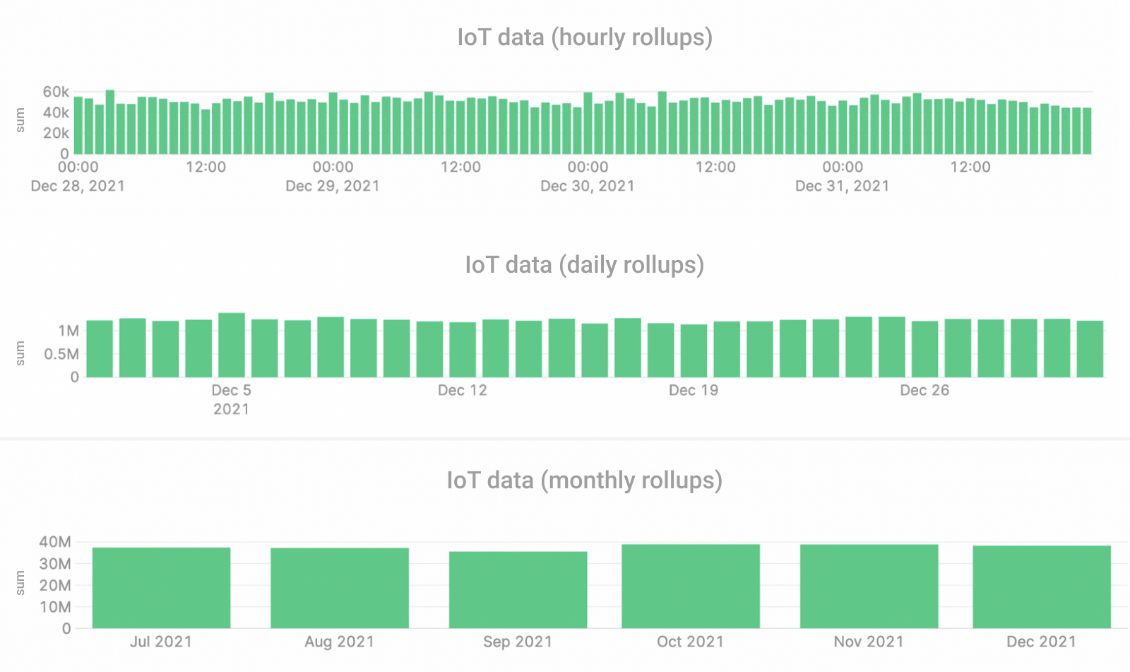
- Forgetting rollups. Time series data can grow quite large, and performing grouped aggregations over large time windows can get expensive. Rollups are a great way to pre-aggregate time series to speed up dashboards. For example, say you want to get the average temperature from an IoT sensor for the last 30 days, but the sensor is providing second-by-second readings. That’s 2,592,000 rows of data to aggregate. However, if you calculate daily rolled-up averages, your dashboard must only aggregate 30 rows at query time.
- Failing to cache. Data can be stored in many different places, each with tradeoffs between cost and speed. The further the data is stored from the request, the longer it takes to fulfill the request. And some kinds of storage are optimized for faster reads. If your dashboard is attempting to query raw files in remote object storage, it will be much slower than querying data on an SSD in local storage. If you fail to utilize caching you’ll suffer slow visualizations as your dashboards query inefficient storage.
Keep in mind, however, that caching only solves latency issues, not freshness problems. Real-time data must be fresh, that is, it must be made available to your dashboards as soon as it is generated. - Using the wrong database. Some dashboards are slow simply because they use the wrong technology. Real-time visualizations over big data demand a real-time database that can handle complex aggregations over millions or billions of rows. Placing a heavy analytics dashboard over an under-resourced Postgres cluster is bound to slow you down. Choose the right database for real-time analytics.
How to build faster dashboards at scale
Hopefully, by now, you’ve bought in on the power of real-time visualizations, and you understand the common gotchas that can prevent you from building them. So, let's explore some strategies to speed up your visualizations for better user experiences.
Optimize queries
One of the most critical aspects of building a fast dashboard is optimizing data queries, especially those over big data. Analyzing large and complex data in real time is often very resource-intensive, and compute requirements can absolutely skyrocket if your queries aren’t optimized.
Bad queries are the most common culprit causing slow dashboards. Optimize your SQL for faster visualizations.
If you’re looking for some quick rules for query optimization, I strongly recommend that you read this article. In summary, you should follow these rules:
- Filter first to minimize read data
- Make sure your table is indexed by your filter field(s)
- Select only the columns you need
- Use subqueries to minimize the right side of JOINs
- Aggregate last
For example, the following query, which is designed to get total product sales for “shoes” in the last 7 days, is horribly inefficient:
Why? Well…
- It scans the entire
eventstable (which could be massive) in the subquery - It places the larger
eventstable on the right side of theJOIN - It requests an unused column in the subquery (
product_manufacturer) - It aggregates and joins before filtering
This query should be rewritten like this:
This query is much more efficient, as it follows the important rules described above, and will scan less data, take less time to return a response, and cost less money to execute.
Consider Time To Live on Queryable Tables or Views
Querying a raw table is often an expensive operation. Consider this scenario: You work for an e-commerce company that writes all clickstream events from your website into storage. Your website generates 100,000 clickstream events per day, and you don’t enforce a Time To Live (TTL) on the raw table.
An analyst writes a query that aggregates the raw data. You have 5 years' worth of clickstream events, so that query processes almost 200 million rows of data every time a dashboard is refreshed. Nope.
Consider pre-filtering time series data, storing only what you need in a new table or view to support your visualizations.
Oftentimes, dashboards don’t need the entire history of raw data. If the scope of the dashboard is limited to the last 30 days, consider a new table or view with a TTL of 30 days. Now your analyst is only asking for three million rows of data per query.
Use Materialized Views for common aggregations
TTLs aren’t enough to make dashboards faster. Querying three million rows won’t win any speed races. Plus, you might want to retain all the historical data to make your dashboards more flexible.
One strategy to reduce query latency is to utilize Materialized Views, a powerful feature of real-time databases that calculates and stores incremental aggregations in real time.
Materialized Views can store pre-calculated aggregates that update in real-time as new data is created.
Materialized Views can be used to pre-compute aggregates and store them for querying. When you refresh the dashboard, you simply query for the pre-computed aggregates instead of performing the aggregation at query time. This will result in faster visualizations.
Cache query results
Caching can significantly improve the latency of your dashboard by reducing the need to fetch data from the underlying data sources repeatedly. Implement caching strategies such as result caching, partial caching, and query caching to store frequently accessed data in memory, reducing the query execution time and improving overall responsiveness.
Keep in mind that while caching will improve the refresh rate of the dashboard itself, it won’t fix a slow underlying data architecture, meaning it will continue to display old data until the cache is refreshed. If you’re working with data that is constantly changing, then caching will have some drawbacks.
Caching can speed up dashboard refresh latency, but it won't solve underlying data freshness issues.
Leverage streaming data sources
If your dashboards still rely on batch ETL processes over stale data in a warehouse, no amount of query optimization or caching will improve the user experience. You’ll still be stuck with hours- or days-old data that’s just not as valuable as real-time.
Making the switch to a real-time streaming data architecture that captures and writes data to storage as soon as it’s generated will work wonders for your real-time visualizations.
Choosing the right technology
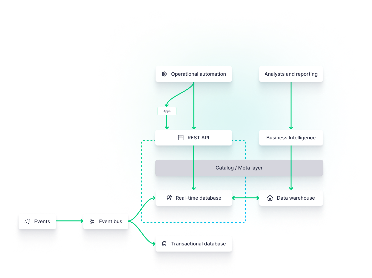
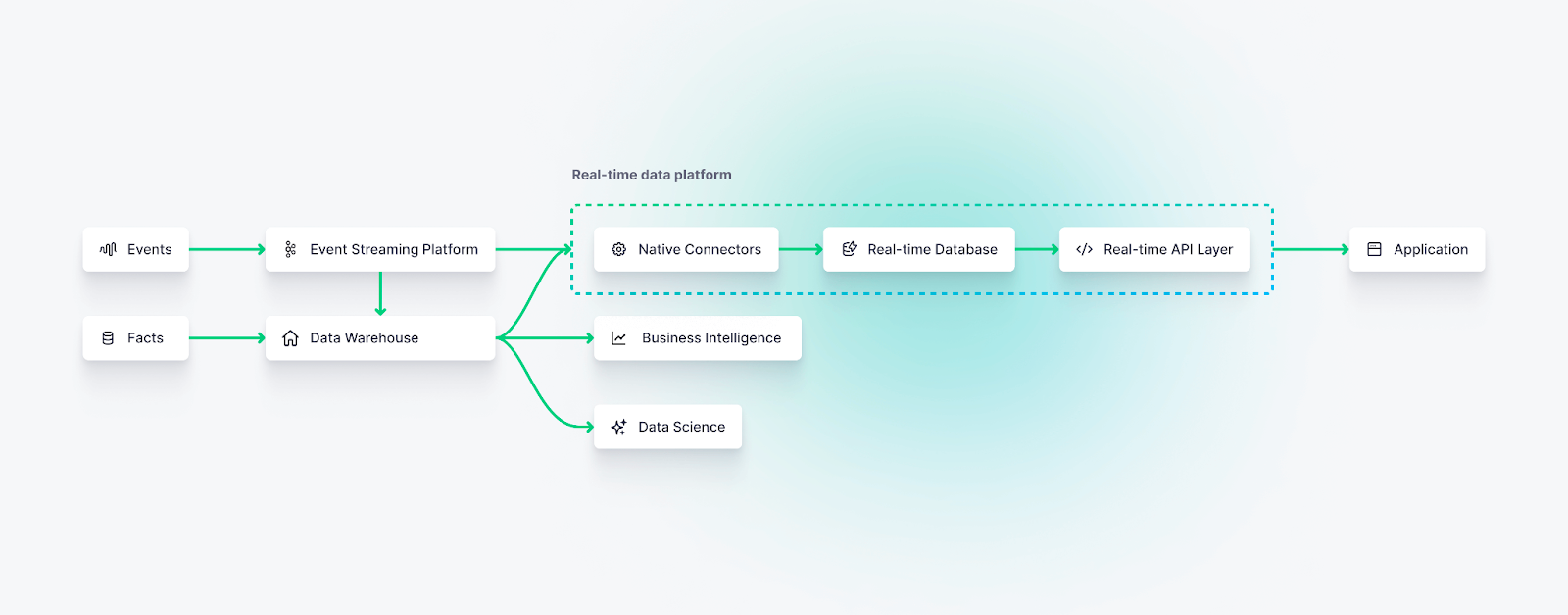
Even if you follow all of the above recommendations, you’ll still suffer inefficiencies if the underlying data architecture is flawed. Real-time visualizations demand real-time data platforms, which include streaming data sources, stream processing engines, real-time databases, and real-time API layers.
By adopting modern [real-time data platforms](https://www.tinybird.co/blog-posts/real-time-data-platforms), you can unify streaming ingestion, transformation, storage, and delivery behind a single architecture that is purpose-built for low-latency analytics, making it easier to scale real-time dashboards without constantly re-engineering your backend.
If you want the fastest dashboards, invest in faster data pipelines and infrastructure better suited to the real-time task.
Tools for Building Faster Dashboards
Choosing the right tools for building faster dashboards is essential to achieve optimal performance and meet your specific requirements. Let's explore some popular dashboard tools and assess their performance capabilities.
Business Intelligence Tools
- Tableau: Tableau is a widely used data visualization tool that offers a range of features for building interactive dashboards. It provides robust performance and scalability and allows integration with various data sources.
- Power BI: Power BI is a cloud-based data analysis tool that enables users to create interactive visualizations and dashboards. It offers seamless integration with Microsoft products and supports real-time data streaming.
- QuickSight: QuickSight is a flexible business intelligence platform that enables Amazon Cloud users to develop and deploy interactive dashboards. It offers in-memory analytics capabilities that enhance performance and supports real-time data integration.
Frontend Frameworks and Libraries
Of course, business intelligence isn’t the only game in town. Business intelligence is for internal stakeholders, but data and engineering teams recently want to start embedding real-time visualizations into their products, whether for external, customer-facing features or internal tooling. Here are some tools that can be used for real-time visualizations within web applications.
- Tremor. Tremor is a newcomer to the real-time visualization landscape, making it quite simple to build React dashboards very quickly through its easy-to-deploy-and-configure real-time dashboard components library. To see an example real-time dashboard build with Tremor components, check out this Web Analytics Starter Kit. Tremor was recently acquired by Vercel.
- shadcn/ui. shadcn is a comprehensive UI component library for many different web frameworks. It includes plenty of configurable chart components for your real-time dashboards.
- Streamlit. Streamlit is an open-source Python library that makes it easy to create and share web apps over big data, and it is uniquely suited for machine learning and data science workflows.
- Highcharts. Highcharts is an interactive charting library built on JavaScript and Typescript, providing a wide range of flexible chart and graph components for visualizing important dashboard metrics, from scatter plots to heat maps.
- Plotly. Plotly is a client library for building fast data-intensive visualizations across a number of languages, including Python, JavaScript, R, and Julia.
- Retool. Retool is a JavaScript-based app-building tool that abstracts the complexities of frontend web development into a series of drag-and-drop components. It integrates well with many data sources and real-time data platforms like Tinybird.
There are many more frontend visualization libraries and tools. These are simply a sample. In most cases, the choice of frontend won’t have direct effects on the speed of your visualizations, rather you’ll need to consider the backend data model.
Backend databases and data platforms
Critical to the performance of real-time visualizations is the data infrastructure that underpins it. This data infrastructure includes all of the various components that capture, persist, and expose data to frontend frameworks and business intelligence tools.
Event streaming platforms and message queues
Event streaming platforms or message queues like Apache Kafka, Confluent, Google Pub/Sub, and Amazon Kinesis may all play a critical role in capturing and transporting real-time data to feed downstream visualizations.
If you want your dashboards to display the most up-to-date data, you'll likely need to adopt a streaming data architecture.
These technologies are critical if you want your dashboards to display very fresh data in real time. To get started with event streaming platforms, learn more about real-time streaming data architectures and how they support real-time visualizations.
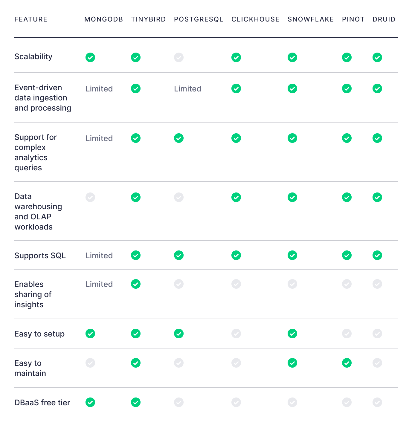
Real-time databases
Real-time databases offer powerful and performant storage that’s optimized for real-time analytics visualizations. These databases can be used as a replacement for or in parallel with transactional databases, data warehouses, or offline feature stores that may be used for data science or machine learning functions, providing a low-latency SQL query engine over columnar storage that’s optimized for aggregations over large data tables.
Examples of open source real-time databases include ClickHouse®, Apache Pinot, and Apache Druid.
Real-time data platforms
Real-time data platforms provide integrated systems that support streaming data ingestion, real-time transformations and materializations, and a real-time API layer for dashboards to make low-latency requests.
Tinybird is a popular, serverless real-time data platform built on top of ClickHouse® that can massively simplify the development of in-product real-time data visualizations.
Conclusion
Real-time data visualization is a powerful tool for businesses seeking to gain actionable insights from rapidly changing datasets. By understanding the basics of real-time dashboard design and implementing strategies to optimize performance, you can build faster dashboards that provide real-time insights when you need them the most. Choose the right tools, design intuitive dashboards, and continuously refine your processes to unlock the full potential of real-time data visualization.
Tinybird is a real-time analytics backend that can be used to build insanely fast dashboards and user-facing visualizations.
If you're worried about the data model that underpins your visualizations, or if your existing model is struggling to scale, consider a real-time data platform like Tinybird. You can sign up for free, with no time limit, and build real-time APIs to power your visualizations in a matter of minutes.
In addition, you can follow this step-by-step guide to build a real-time dashboard using Tinybird and modern frontend development tools.
If you're looking for more resources about Tinybird, check these out: