


Go look at our docs. The sidebar is shorter. That's on purpose.
We took the docs apart and put them back together with a stricter rule: at most two levels of indentation, ideally one. Everything else followed from that constraint.
Here's what changed:
- The structure now reads like the path a developer actually takes: quickstart, dev workflow, core concepts, actions, guides.
- SDK examples (TypeScript and Python) live next to the CLI and HTTP calls across the action sections, not tucked away in a reference appendix.
- The visual style got tightened up: new type stack, higher-contrast dark mode, refreshed navigation.
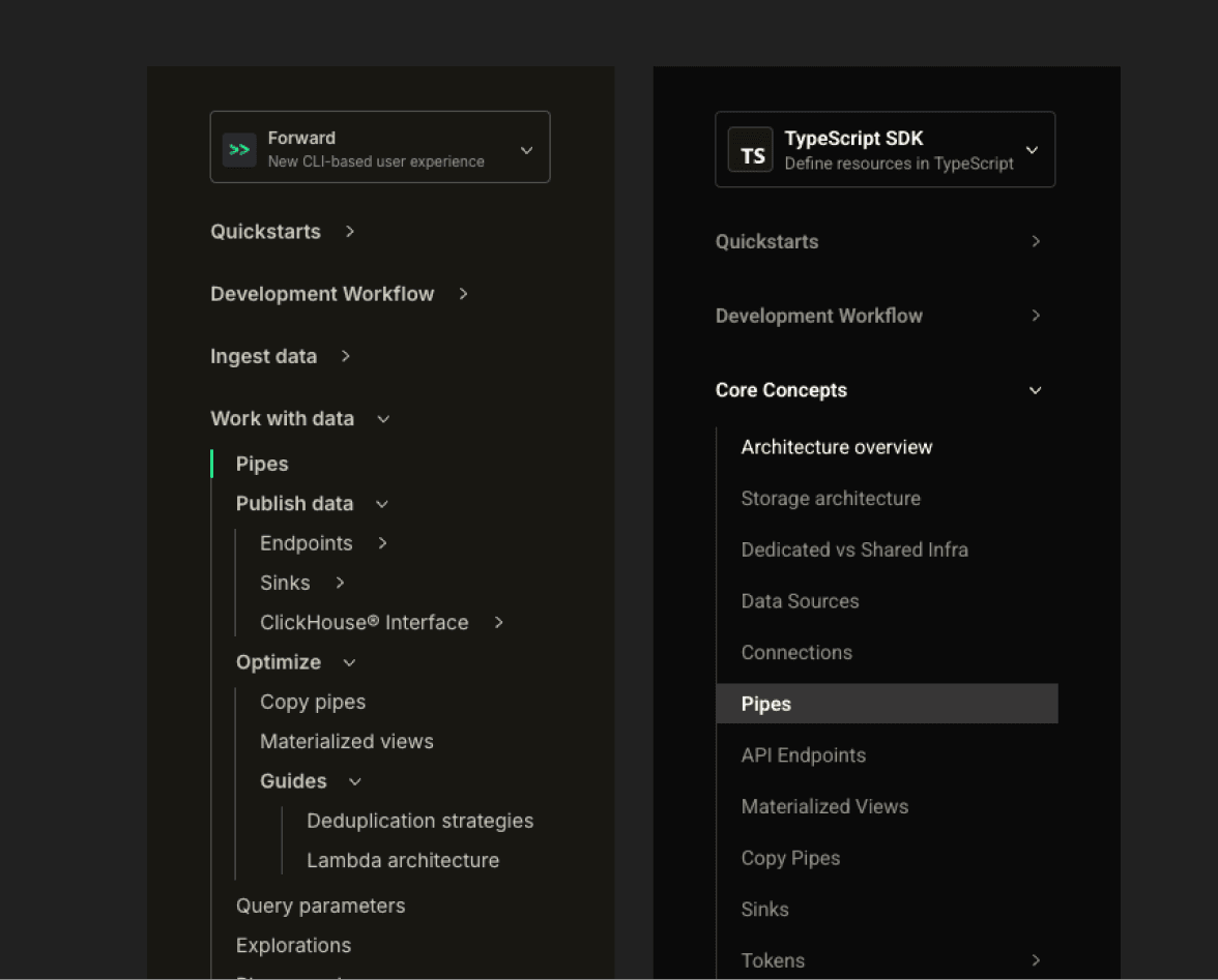
- The Classic / Forward toggle is gone. In its place: a CLI / TypeScript SDK / Python SDK selector that keeps examples aligned with how you build.
Why the old sidebar got in your way
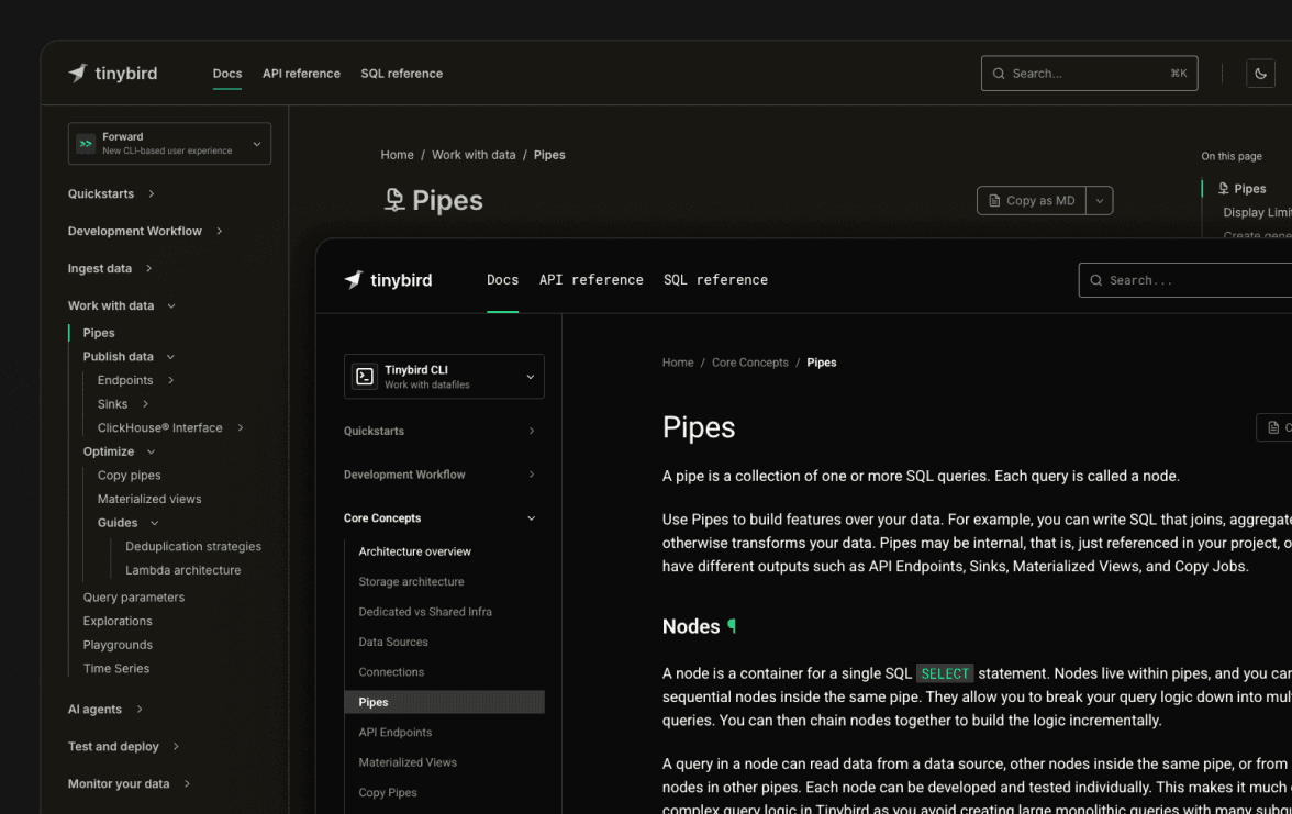
The old docs grew the way docs always grow: page by page, feature by feature. A new connector ships, a page goes under "Ingest". A new export lands, a page goes under "Sinks". A feature has UI and CLI flavors, both get their own subtree. Six months later you have four levels of nesting and a sidebar you scroll through twice before finding "Kafka".
Every new page that needed a home got one nested somewhere. The result was a sidebar that read like an org chart, not like a developer's mental model of the product.
We also had two parallel doc trees, Classic and Forward, with a toggle at the top. The toggle was honest (the two versions of the product are a bit different) but the cost was real: every time someone landed on docs from a search engine, they had to figure out which tree they were in before they could read anything. Now that Forward is where everything new ships and the default for new accounts, it made sense to make it the default in docs too.
The new shape
The sidebar now follows the actual arc of working with Tinybird, top to bottom.
Quickstarts: pick a stack (TypeScript SDK, Python SDK, or the Tinybird CLI), run a few commands, see the product working. The goal is to get a real sense of Tinybird in the minimum time possible. If it takes you longer than the quickstart says, that's a docs bug. Tell us in Slack.
Development workflow: how you actually build, day to day. The recommended default is now cloud branches. Every developer gets an isolated environment in the cloud, no local setup required. Local development is still first-class and documented, but it's framed as the option for CI pipelines and heavier users who want a tighter loop. Manual deployment, CI/CD, and example projects live in the same section, so the path from "I made a change" to "it's in production" is one click away.
Core concepts: definitions. What a Data Source is. What a Pipe is. What a Deployment is. What a Token is. What Tinybird Local is. Read these once when you start, come back when something surprises you. If a page is a definition, you'll find it here.
Actions: the verbs. Ingest data. Query data. Copy and export. Monitor. Each action has its own short section with the protocols, the formats, the SDKs, and the CLI commands you'd use. If you're trying to do something, you should land here.
Guides: everything else. Stripe ingestion, Grafana integration, migration from Postgres, the works.
The first four blocks are tightly structured. Guides are deliberately flat.
Guides are not meant to be navigated
This is the part that confused us most while we were doing it, so it's worth saying out loud: guides are a junk drawer, on purpose.
You don't open the Guides section and browse it top-to-bottom. You arrive at a guide because something else linked to it: a Core Concepts page that needed a concrete example, an Action page that wanted to show a specific integration, a search result, a Slack answer from support.
If we tried to organize guides into a clean taxonomy, we'd be back to four levels of nesting within a year. Instead, guides are flat and abundant. New ones can land without anyone arguing about which subfolder they belong in. The cost is that the Guides section looks long. The benefit is that the rest of the docs stay short and the guides can be added without a meeting.
SDKs in all the docs
When we shipped the TypeScript SDK earlier this year, we stuffed it into the Reference section and called it a day. That was a mistake.
Most readers are not flipping through a reference. They're on the "Events API" page trying to figure out how to send data, and the answer they want is the SDK call, right next to the CLI command and the HTTP request.
So we went through every Action page and added the SDK variant inline, alongside the CLI and the raw API. If a thing can be done from the TypeScript SDK, the Python SDK, the CLI, or the API, the variants are tabbed on the same page. You pick the one that matches your stack.
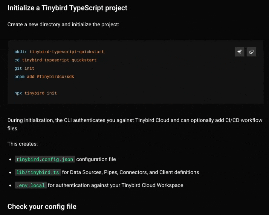
That choice now travels with you. The sidebar has a method selector with three options: Tinybird CLI, TypeScript SDK, and Python SDK. Pick TypeScript once and compatible code examples open on the TypeScript SDK tab as you move through the docs. Switch a tab inside an example and the sidebar updates too. The docs remember the preference, because nobody should have to click the same tab on every page.
The Reference section still exists, with the full type catalogues for both SDKs. But it's the lookup, not the entry point.
Style changes you'll actually notice
The look got tightened up too. The biggest ones, in order of how much you'll feel them:
- New type stack. Inter and the old monospace are out. The body is now Roboto and code is Roboto Mono, so prose and code samples share a family and stop fighting each other for attention.
- Higher-contrast dark mode. The dark background went from a warm grey to a near-black, and body text went from cream to pure white. Long reading sessions are easier on the eyes and code blocks pop more.
- Refreshed sidebar and navigation. Sidebar, breadcrumbs, doc navigation, footer, table of contents, feedback form, theme switcher: all reworked. Less visual noise around the content, more room for the content itself.
- Explain with AI. Code snippets now have an Explain with AI button. It sends the snippet to your assistant with enough context to explain what it does, so an information-dense Pipe, API request, or SDK example is easier to inspect without leaving the page.
Nothing radical. Just less in your way.
Goodbye, Classic toggle
Classic docs aren't gone. They're still online at tinybird.co/docs/classic, and they'll keep living there for as long as people are running Tinybird Classic in production.
But the toggle at the top of every page is gone. The default docs are the current docs. If you need the Classic ones, there's a quiet link in the sidebar. Most people don't, and the toggle made them stop and decide every time.
The new selector asks a better question: how do you want to build? Tinybird CLI if you work with datafiles, TypeScript SDK if you want typed resources in TypeScript, Python SDK if you define resources in Python. That's the decision you actually make while reading a how-to page.
If you're still on Classic, this is a good moment to plan your move. Forward is where everything new ships, and the Migrate from Classic guide walks you through it.
How we picked the shape
A few people shaped it. Sancha pushed on the initial structure until it stopped looking like an org chart. Ari took the visual restyling, Gonzalo worked through the page-by-page structure and content, and Pablo stitched it together so it shipped as one piece. Then a lot of iteration: completing pages, splitting ones that had grown too big, merging ones that had grown too small, killing the stubs.
The rule that did the most work was the two-level cap on the sidebar. Once you can't nest your way out of a problem, you have to rename a section, promote a page, or accept that something belongs in the guides bin. All three are productive moves. Nesting is not.
If you see something, say something
Restructuring docs is a forever-job. Even with the new shape, there are pages that contradict each other, broken links left over from the old structure, examples that haven't been updated to use the SDKs, and probably a Classic-era diagram or two hiding in a guide.
If you find something off, ping us in the community Slack. The faster we hear about it, the faster it gets fixed.
And if you haven't yet, poke around and see if the new shape matches how you actually use Tinybird. That's the only test that matters.